Help Text as a PDF file,
single html file, or
split into multiple html files
The Digital Athletic Log


Next: 10 Exporting Data
Up: Digital Athletic Log Help
Previous: 8 Goals
Subsections
9 Plots
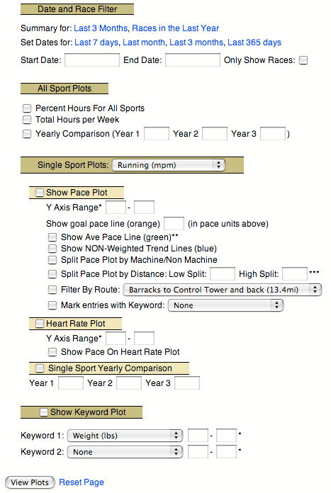
You may view plots of your training data by selecting the ``View your... graphs'' link.
Currently there are five plots available from the ``View Graphs'' page. See Section 8 for information on plotting goals, and Section 12.3 for information on plotting data in the remarks fields of entries. The ``Goal Plots'' are displayed on the ``View your... goals'' page. Plots in the remarks of entries are displayed when the entry is edited.
The plotting feature I use most often is the ``View summary for Last 3 Months'' link (Figure 20). This displays training data for the last three months using a ``Time in Each Sport'' pie chart (Figure 21) and an ``Hours per Week'' plot (Figure 22).
Figure 20:
The view plots form.
|
|
The date range specified at the top of the page applies to all the plots generated by the page. This allows an easier comparison between different plots. Several of the plots allow you to manually specify the scale of the y axis. This can clarify a plot.
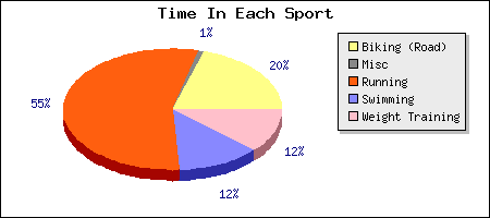
Figure 21 displays the fraction of time spent in each sport during the specified date range.
Figure 21:
The time in each sport pie chart.
|
|
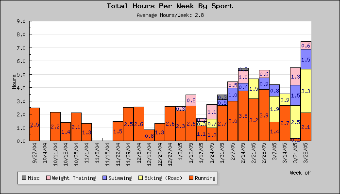
Figure 22 displays the total hours for your sport entries by week. Each week's bar is color coded by the amount of time spent in each sport. If the plot is displaying less than 27 weeks, each sport is labeled with its total duration (in hours). Additionally, it displays the average hours per week for the time period plotted.
Figure 22:
The hours per week plot.
|
|
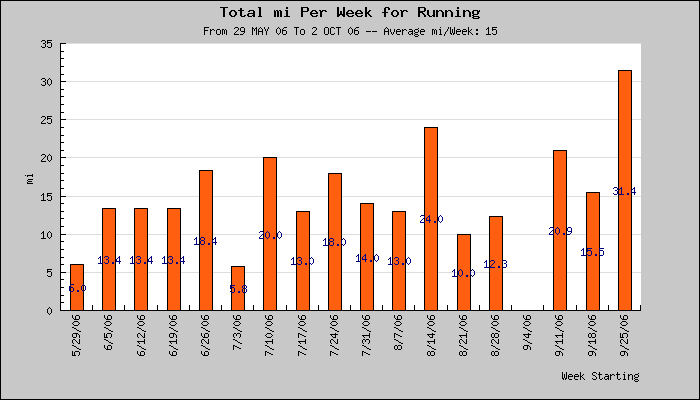
Figure 23 displays the total distance per week for a specified sport.
Figure 23:
The distance per week plot.
|
|
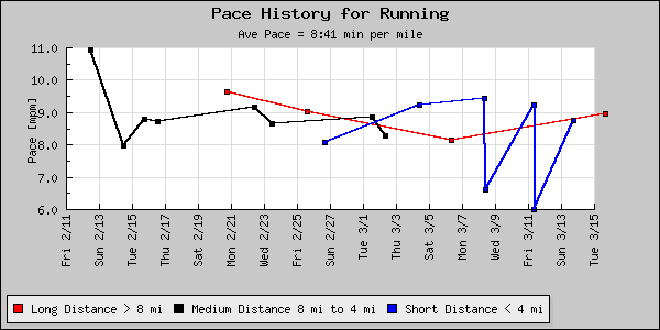
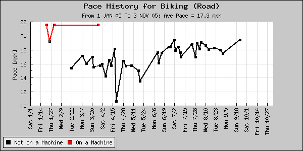
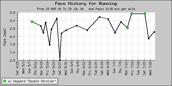
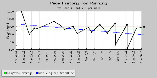
The pace plot (Figures 24, 25 and 26 ) displays pace data for the specified sport. Additionally, it can superimpose the following data on the pace plot:
- Average Pace Line:
- It is displayed in green.
- Trend Line:
- This is a non-weighted trend line (i.e. a 2 mi run will be weighted the same as a 13 mi run in determining the best fit through the data). It is displayed in blue.
- Split by Distance:
- The pace plot can split the data into 2 or 3 distance ranges. This allows you to compare your pace over long, medium, and short distances. The split is specified by entering a `high split' and a `low split' in the default distance units for the sport. Figure 25 shows an example of the low split =4 and the high split =8. If the low and high split are set to the same value (or only one is entered), the pace plot is only divided in two lines.
- Split by Machine/Non Machine:
- This takes the pace data and plots it as two lines. One line (red) is for entries done on a machine (treadmill, exercise bike, etc), the other line (black) is for entries that were not done on a machine. The machine/non machine determination is made by the ``is machine'' field for each entry. Figure 26 shows an example of this split. This plots is useful if you are force to spend a fair bit if the year working out on equipment indoors.
- Filter by Route:
- This allows you to only plot exercises run over a particular route.
- Mark entries with Keyword:
- This allows you to mark the entries which have a particular keyword associated with them. You can use this to compare your pace times on different pieces of equipment if you are using the equipment tracking feature of the log. Figure 27 shows an example of some entries marked with green circles.
Figure 24:
The pace plot with the average value (green)
and trend line (blue) superimposed.
|
|
Figure 25:
The `Pace Plot' split into long, medium, short distances.
Here the `low spilt' = 4 and the `high split' =8.
|
|
Figure 26:
The `Pace Plot' split by machine and non machine entries. Allowing a comparison
between my pace on and off an exercise bike.
|
|
Figure 27:
The entries which have the keyword ``Double Stroller'' associated with them are marked with
a green circle. I really am slower pushing that stroller.
|
|
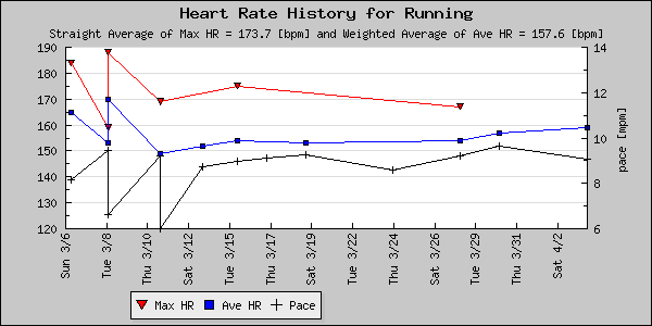
The heart rate plot (Figure 28) displays the maximum and average heart rate values entered in sport entries. Only data from the sport selected in the pace plot section is displayed. The pace data can be displayed on the heart rate plot as well.
Figure 28:
The heart rate plot with pace displayed too.
|
|
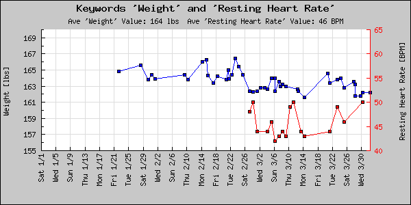
Figure 29 is the keyword plot, It can display one or two keywords over the specified date range. The average value (also over the specified date range) of each keyword is displayed in the subtitle. If the two keywords selected the have the same units, both will be plotted on a single Y axis. If the keywords have different units, they are plotted using different Y axes.
Figure 29:
The keyword plot showing a pair of keywords plotted.
|
|
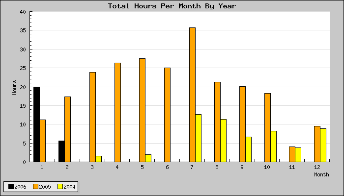
Figure 30 is the yearly comparison plot. This plot allows you to specify up to three years and it will plot your total total hours per month for each of these years. The plot can also compare only race hours or only hours in a single sport.
Figure 30:
The yearly comparison plot showing total hours exercised in 2006, 2005, and 2004.
|
|
Next: 10 Exporting Data
Up: Digital Athletic Log Help
Previous: 8 Goals
Contents
Roger Cortesi
2006-11-12